Product Screenshots and Demo Videos That Do the Selling
7 min read
The short answer
Lead with a screenshot of your real interface doing the core thing, filled with realistic content rather than placeholder text. Three to five images beats twelve near-identical ones, and a demo video should be under sixty seconds and legible with the sound off. The first image doubles as your social preview, so pick the one that explains the product fastest.
Most people decide whether to read your page based on one image. It appears in the feed, in the social preview when someone shares you, and at the top of your listing. It is worth more attention than the twelve other things people spend launch week on.
Show the product, not a poster of the product
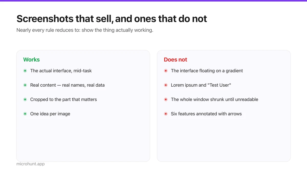
The instinct is to make something designed — the interface floated on a gradient, a device frame, a tagline overlaid. It looks professional and it communicates less than a plain screenshot, because a reader trying to work out what your tool does learns nothing from a logo on a colour.
| Works | Does not |
|---|---|
| The actual interface, mid-task | The interface floating on a gradient |
| Real content — real names, real data | Lorem ipsum and "Test User" |
| Cropped to the part that matters | The whole window shrunk until nothing is legible |
| One idea per image | Six features annotated with arrows |
| Light mode unless dark is the point | Dark mode that renders as a black rectangle in a feed |
Populate your demo data first
This is the highest-return twenty minutes available in launch week and almost nobody spends it. Placeholder content signals unfinished more loudly than any missing feature, and readers are unforgiving about it because it is the one thing they can assess without trying the product.
- Replace Lorem ipsum with sentences a real user would have written.
- Use plausible names, not "User 1" and "asdf".
- Fill empty states — a task list with three tasks beats a beautiful empty state.
- Make the numbers realistic. A dashboard showing 1,000,000 users looks like a mock.
- Check for anything embarrassing before you screenshot. Test data has a way of surfacing.
How many, and in what order
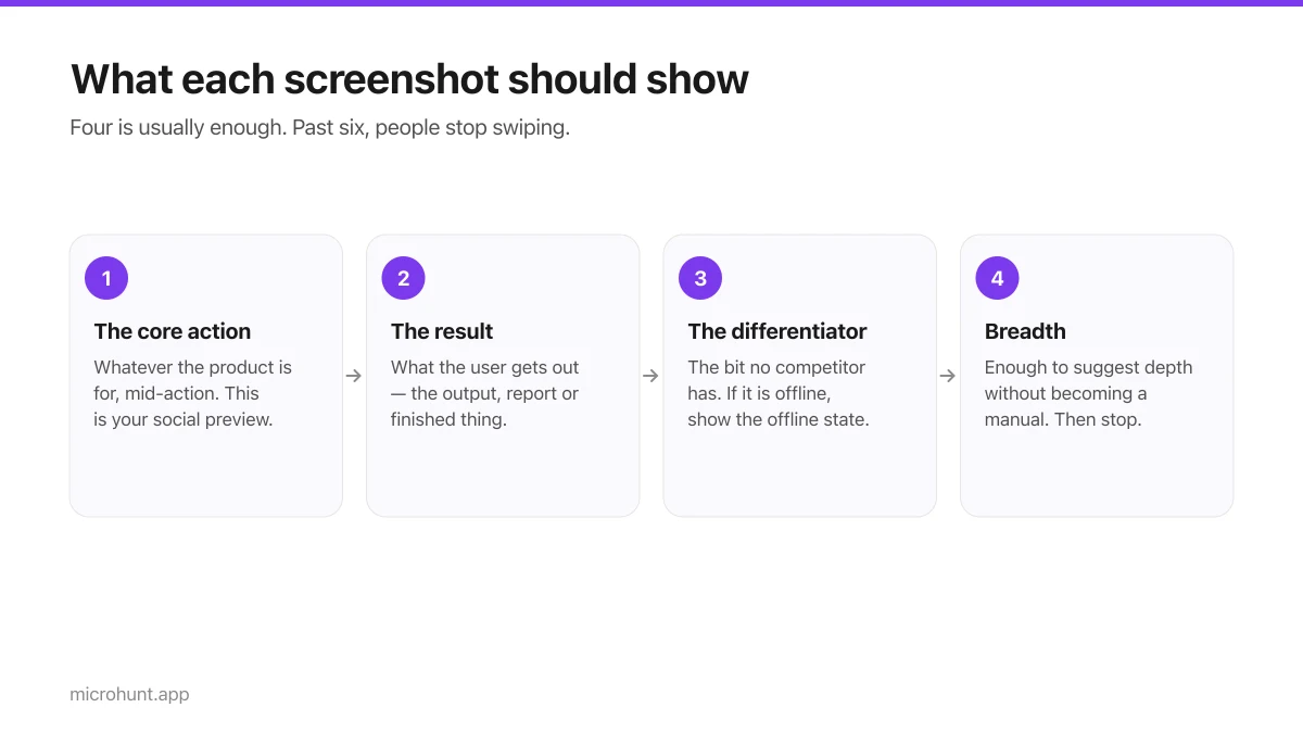
- 1First: the core actionWhatever the product is fundamentally for, mid-action. This is your social preview, so it carries the most weight.
- 2Second: the resultWhat the user gets out. The output, the report, the finished thing.
- 3Third: the differentiatorThe bit no competitor has. If your pitch is local-first, show the offline state.
- 4Fourth and fifth: breadthEnough to suggest depth without becoming a manual. Stop here — past six, people stop swiping.
The demo video
Optional, and genuinely useful for products whose value is hard to convey in a still frame — anything with motion, timing or a multi-step flow.
The rules are unglamorous. Under sixty seconds. Start inside the product, not on a title card. Make it work with the sound off, because most people watch muted. Show one complete task rather than a tour. And if you have to explain what is happening in a voiceover, the interface is doing something a screenshot could not have shown, which is fine — just caption it.
The technical bits that matter
- **Aspect ratio.** Shoot roughly 16:9. Anything wildly different gets letterboxed or cropped somewhere.
- **Resolution.** Capture at 2x and let the page scale it down. Upscaled screenshots look soft.
- **File size.** A 5MB screenshot slows the page it is meant to sell. Modern formats, sized to display.
- **Legibility at small sizes.** Look at it as a thumbnail. If the text is unreadable, crop tighter.
- **Dark mode.** If your product is dark by default, check it does not disappear against a dark feed.
One last check before you publish: look at the whole set on a phone. That is where most people will see it, and an image that reads well at laptop width sometimes turns to mush at 375 pixels.
Frequently asked questions
- How many screenshots should a product page have?
- Three to five. One is not enough to explain most products, and past six people stop swiping. Each should show something different rather than repeating the same screen.
- Should the first screenshot be a designed graphic?
- No. A plain screenshot of the real interface doing the core thing communicates faster than a stylised render, and it doubles as your social preview so it needs to explain the product on its own.
- Do I need a demo video?
- Only if your product's value involves motion, timing or a multi-step flow that a still cannot show. If you make one, keep it under sixty seconds and make it legible with the sound off.
- What resolution should screenshots be?
- Capture at roughly twice the display size so they stay sharp on high-density screens, then export in a modern format sized for the page. Upscaling a small capture always looks soft.
Keep reading
The Seven-Day Launch Checklist
A day-by-day plan for the week before you launch, weighted towards the things that actually change the outcome.
How to Submit a Product on Vuru (Step by Step)
A walk through the submission form, what each field does to your page, and the fields most people leave empty that they shouldn't.
Nine Launch Day Mistakes We See Every Week
The recurring problems that cost people a good launch, and what to do instead. Most of them are copy problems, not product problems.