Colour
Palettes, contrast checking and colour systems.
Nothing launched in this category yet.
Be the firstAbout Colour
Colour tooling is deceptively deep. The surface version is a palette generator, and there are many. The version that matters to anyone shipping an interface is about contrast, consistency and perceptual uniformity, and the launches doing that work are among the more quietly valuable things in the design category.
The most consequential shift in this space has been the move to perceptual colour spaces. Picking colours in the old model produces palettes where two swatches with the same stated lightness look nothing alike, and where a gradient passes through a muddy grey in the middle. Working in a perceptually uniform space fixes both, which is why tools built on it produce ramps that look even without hand correction. If you are building a design system, this is the single most useful property to look for.
Accessibility checking is the other half of the category and should be non-negotiable rather than a feature. Contrast ratios are a legal requirement in many contexts and a usability requirement in all of them, and the useful tools check the combination you are actually shipping — text on the real background, at the real weight and size — rather than a pair of hex codes in isolation. Tools that also simulate the common forms of colour vision deficiency will catch the chart legend that becomes unreadable for a meaningful share of your audience.
For interface work specifically, the tools that generate a full scale from one seed colour save real time, provided the scale is even and the steps are predictable. A good system produces the same perceived jump between step four and five as between eight and nine, so a component can move a step without a designer re-checking it.
Dark mode is where palettes usually break, and it breaks for a structural reason: inverting a light palette does not produce a good dark one, because perceived contrast behaves differently on dark ground. Tools that generate both from a shared definition, rather than flipping one into the other, produce results that need less correction.
There is also a genuinely fun end of this subcategory — palette extraction from images, gradient tools, colour naming, and the small toys that exist because someone found the maths interesting. Those belong here too.
From the blog
Reading on launching, ranking and colour.
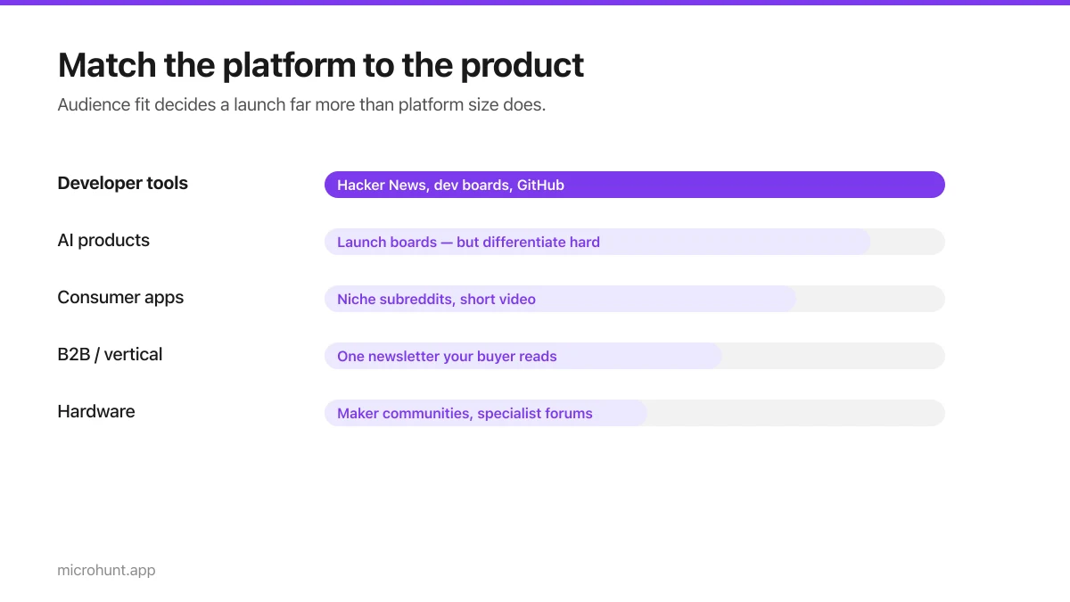
Best Product Hunt Alternatives for Launching in 2026
Where else to launch when Product Hunt is not the right fit — what each platform is actually good at, who shows up, and what it costs.
8 min read
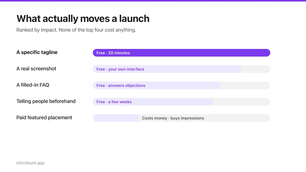
Free Launch Platforms for Indie Makers (No Budget Needed)
You do not need to pay to launch. Here are the places that are genuinely free, what each expects from you, and where paying is actually worth it.
7 min read
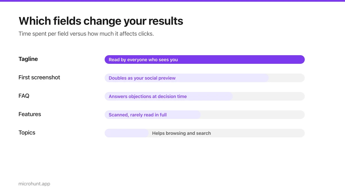
How to Submit a Product on Vuru (Step by Step)
A walk through the submission form, what each field does to your page, and the fields most people leave empty that they shouldn't.
7 min read
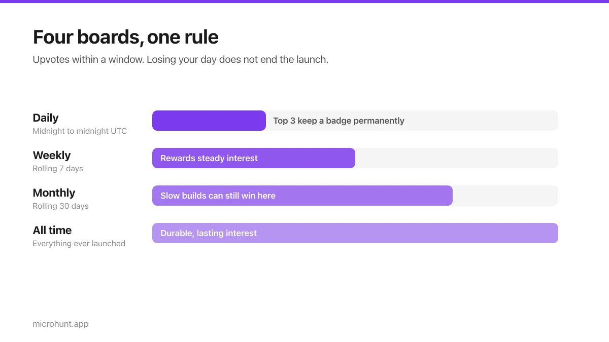
How Vuru Ranking Works (And How to Win a Badge)
Launch windows, upvotes, podium badges and what we do about vote manipulation — the whole ranking system explained plainly.
7 min read
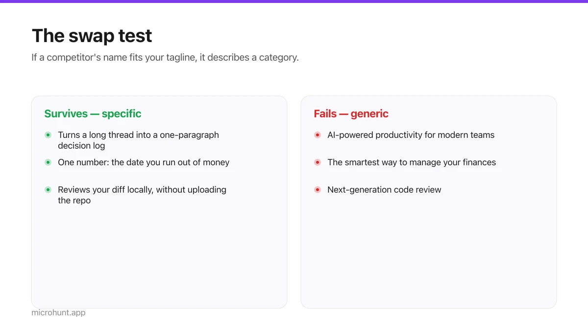
How to Write a Product Tagline That Actually Gets Clicked
The one line most people will ever read about your product, and a simple test for whether yours is doing any work.
7 min read
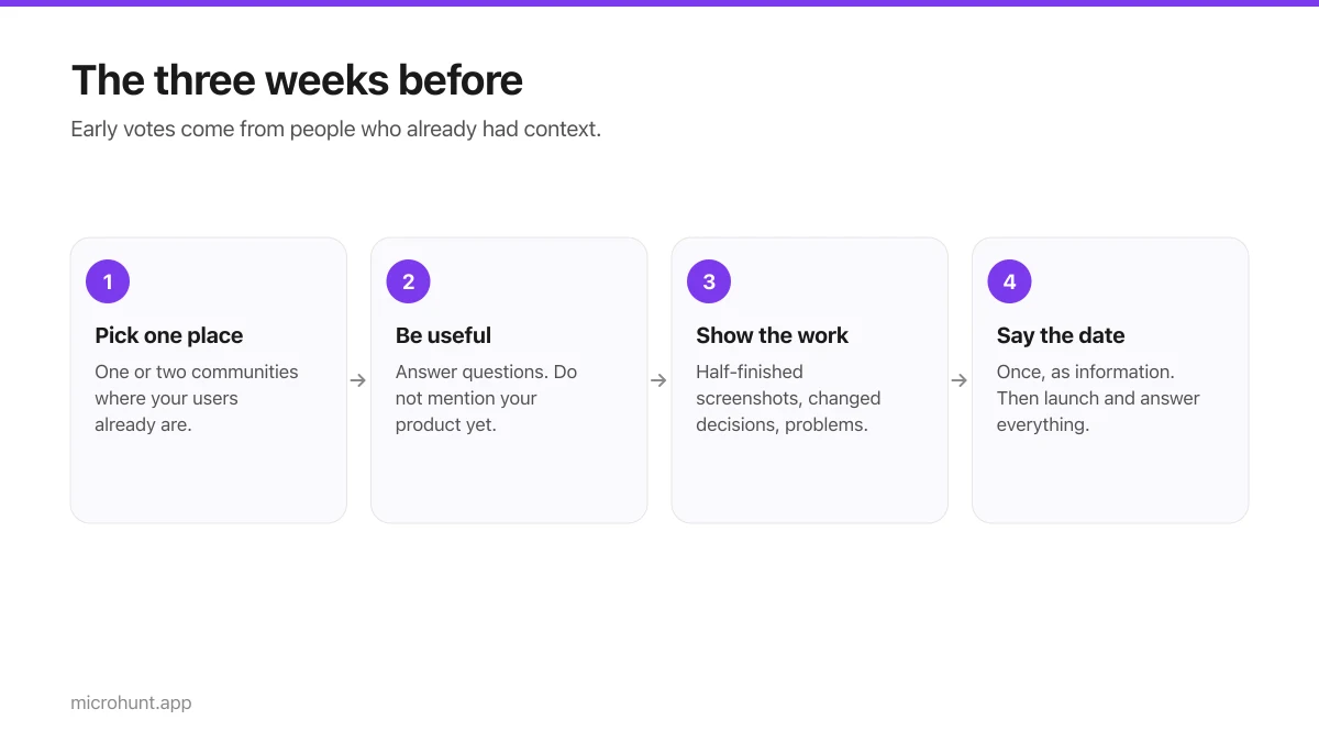
How to Get Your First Upvotes Without Begging
What actually generates early votes, why vote-for-vote groups do not work, and the approach that keeps paying off after launch day.
7 min read
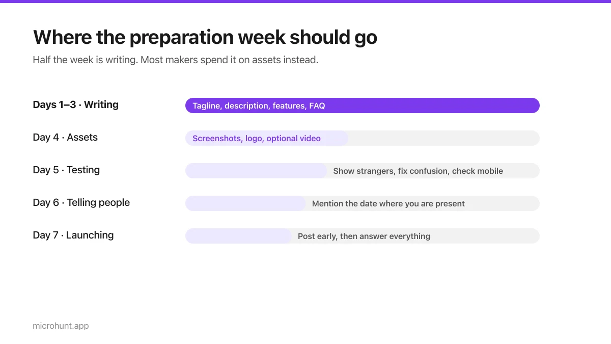
The Seven-Day Launch Checklist
A day-by-day plan for the week before you launch, weighted towards the things that actually change the outcome.
8 min read
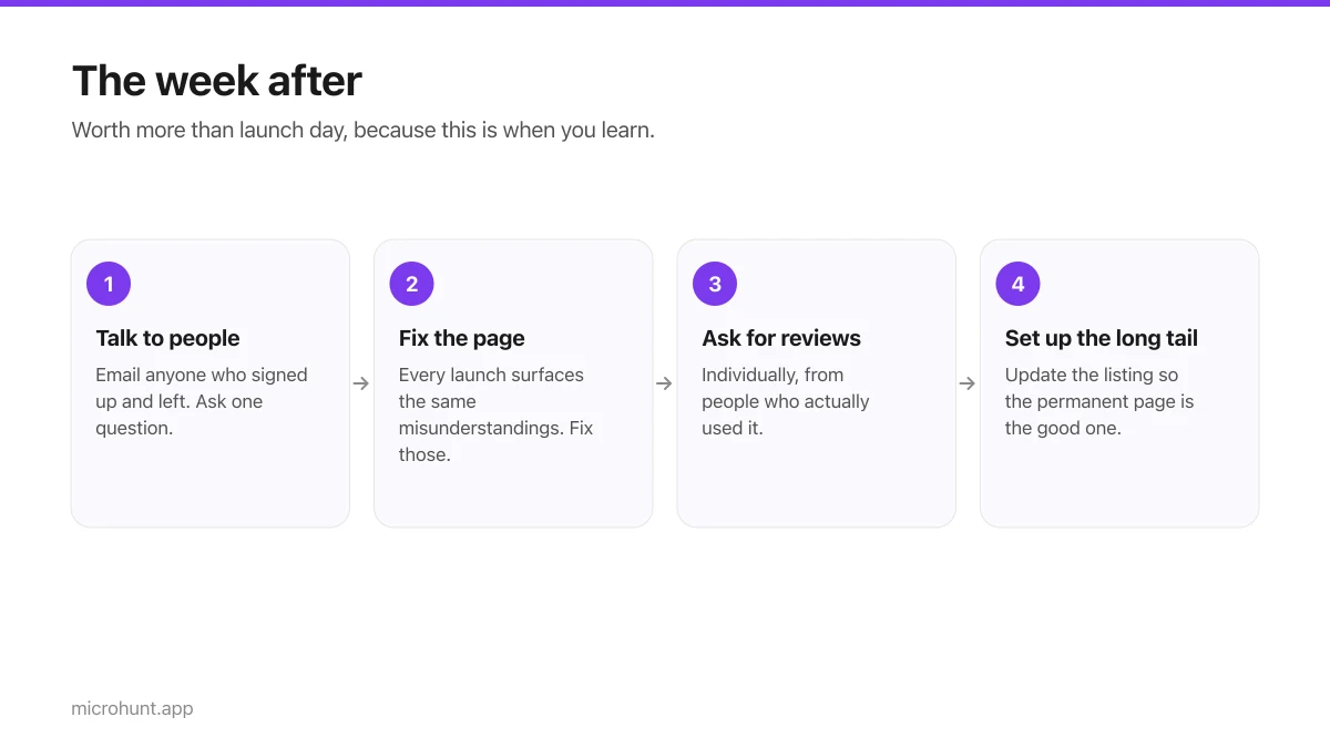
What to Do the Week After Launch Day
The traffic spike is over. Here is how to turn a day of attention into something that lasts longer than the graph.
7 min read