Dashboards & BI
Reporting and business intelligence.
Nothing launched in this category yet.
Be the firstAbout Dashboards & BI
Business intelligence and dashboard tools convert a database into something a person can look at, and the category's persistent problem is that looking at something is not the same as learning from it. Most organisations have more dashboards than questions, and the ones built for a specific decision are the only ones that get used past the first month.
The practical split among the launches here is between self-service tools, where non-technical users build their own views, and code-defined tools, where analysts define metrics in version-controlled files and everyone consumes them. Self-service is faster to adopt and produces the classic failure: four dashboards showing revenue, none of which agree, because each author defined it slightly differently. Code-defined semantic layers solve exactly that by making the definition of a metric a single reviewed artefact, at the cost of setup and a dependency on analysts.
If there is one thing to insist on, it is that number should mean one thing. A shared definition layer — even a documented one in a wiki — resolves more analytical confusion than any visualisation feature.
On visualisation itself, the good defaults are boring and well established: bar charts for comparison, lines for change over time, axes starting at zero for bars, no dual axes implying a relationship that is not there, and colour used to distinguish rather than decorate. Tools that make bad charts hard are doing you a favour. Anything defaulting to a three-dimensional pie chart is not.
Query cost is the operational surprise in this subcategory. Dashboards that refresh on a schedule against a warehouse charging per query scanned can quietly become a large line item, particularly when they are refreshing hourly for an audience that looks weekly. Caching, incremental refresh and simply reducing the schedule are the levers.
Access control deserves a check: a dashboard tool connected to a warehouse frequently sees everything, and row-level restrictions are a feature rather than a default. The salary table is in there somewhere.
The most useful dashboards answer one question, are looked at on a rhythm, and have an owner who removes them when the question stops mattering. See [analytics](/categories/analytics) for product and web measurement specifically.
From the blog
Reading on launching, ranking and dashboards & bi.
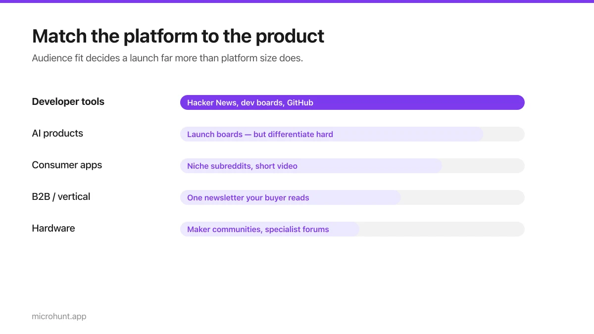
Best Product Hunt Alternatives for Launching in 2026
Where else to launch when Product Hunt is not the right fit — what each platform is actually good at, who shows up, and what it costs.
8 min read
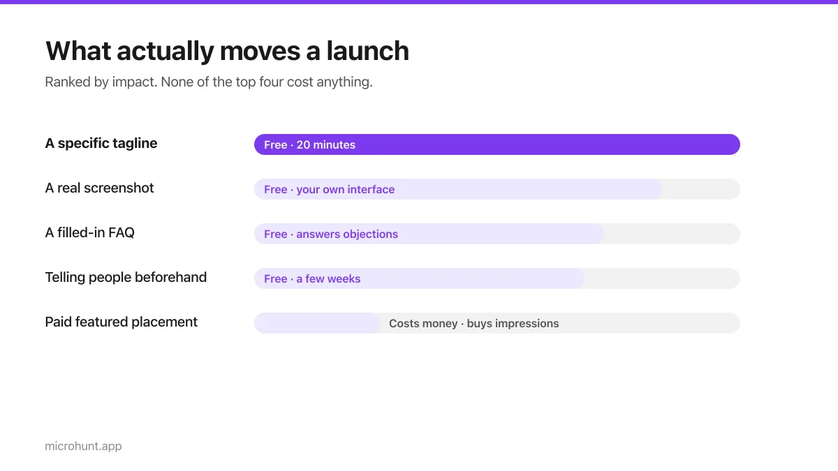
Free Launch Platforms for Indie Makers (No Budget Needed)
You do not need to pay to launch. Here are the places that are genuinely free, what each expects from you, and where paying is actually worth it.
7 min read
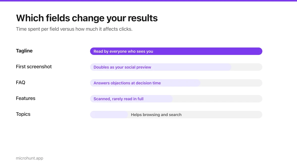
How to Submit a Product on Vuru (Step by Step)
A walk through the submission form, what each field does to your page, and the fields most people leave empty that they shouldn't.
7 min read
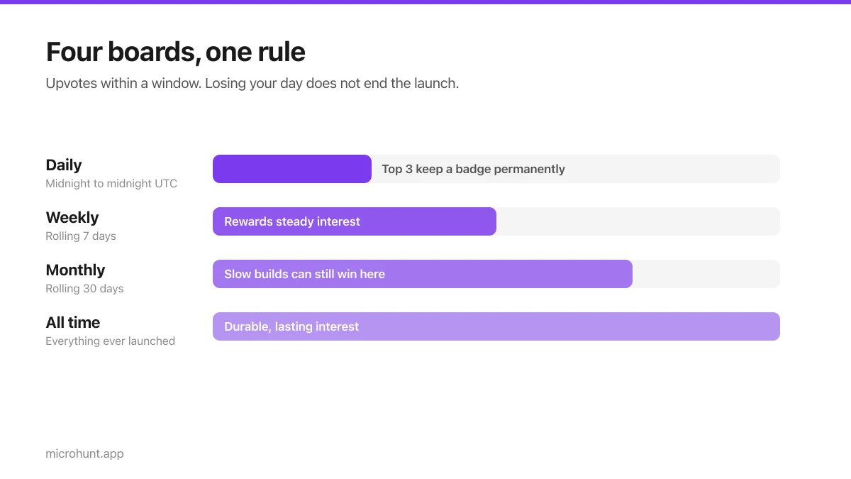
How Vuru Ranking Works (And How to Win a Badge)
Launch windows, upvotes, podium badges and what we do about vote manipulation — the whole ranking system explained plainly.
7 min read
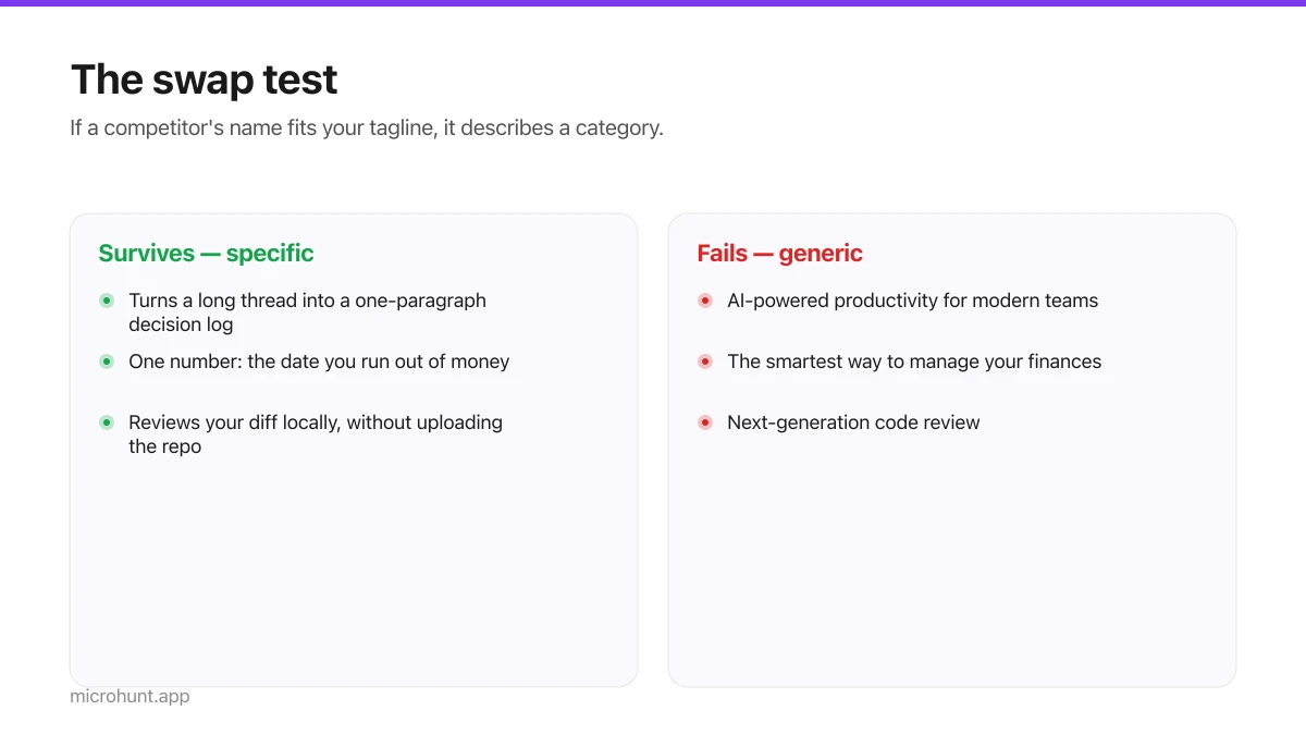
How to Write a Product Tagline That Actually Gets Clicked
The one line most people will ever read about your product, and a simple test for whether yours is doing any work.
7 min read
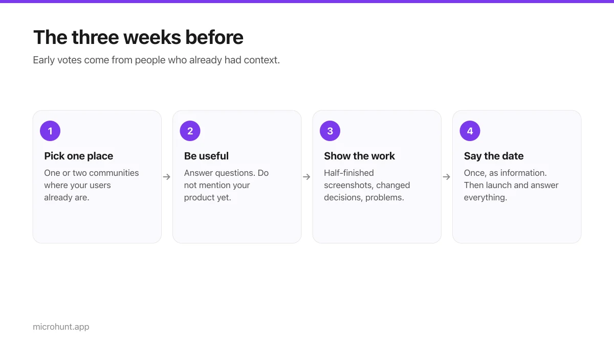
How to Get Your First Upvotes Without Begging
What actually generates early votes, why vote-for-vote groups do not work, and the approach that keeps paying off after launch day.
7 min read
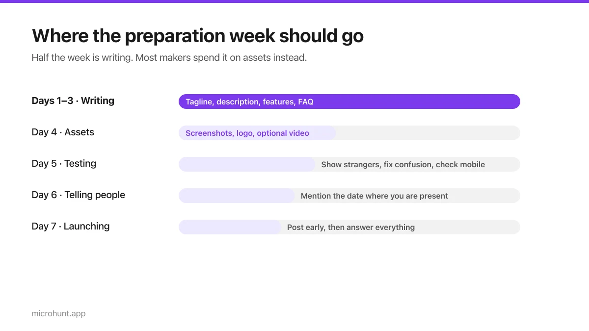
The Seven-Day Launch Checklist
A day-by-day plan for the week before you launch, weighted towards the things that actually change the outcome.
8 min read
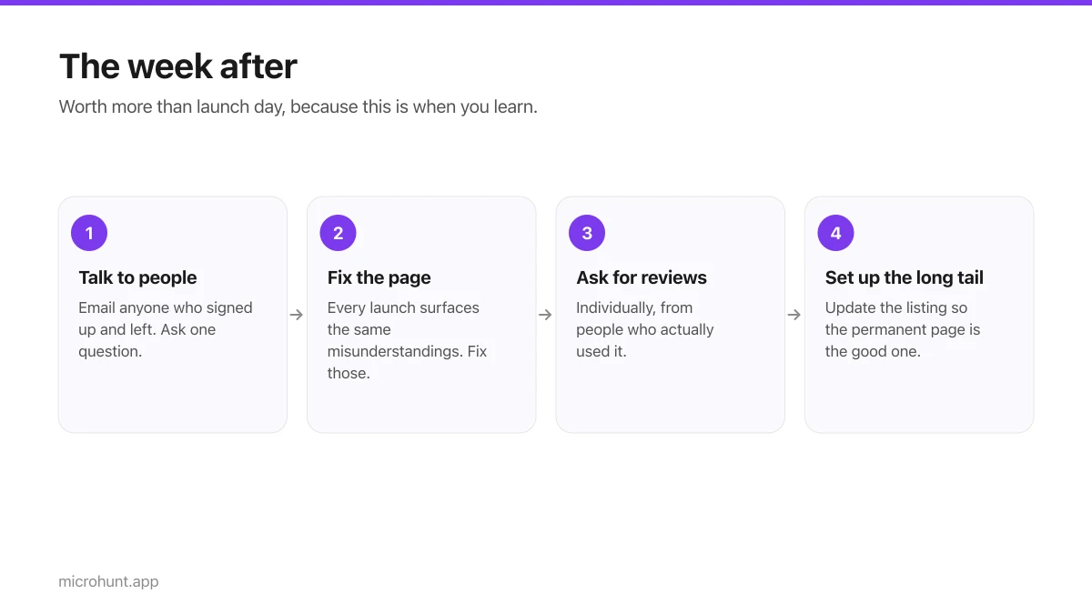
What to Do the Week After Launch Day
The traffic spike is over. Here is how to turn a day of attention into something that lasts longer than the graph.
7 min read