Design
Design systems, prototyping, typography and illustration.
43 products · page 3 of 3
- Design web apps and sync with your own codebase
Timeful
Design web apps and sync with your own codebase
- Design Mac lock screen messages that fit
LockLines
Design Mac lock screen messages that fit
- Describe your logic. Generate Admin UI, MCP & WebMCP.
Mantle
Describe your logic. Generate Admin UI, MCP & WebMCP.
About Design
Design tooling has fragmented in a way that turns out to be healthy. For years the category meant one or two large applications and a set of plugins orbiting them. Now it covers small, sharp utilities that do a single job unusually well — extract a palette, fix kerning in a wordmark, generate accessible colour ramps, turn a screenshot into an editable layout, add convincing film grain without wrecking a performance budget.
The launches here span that whole range. Some are full environments for interface work. Many more are single-purpose tools that solve a problem you hit once a month and resent every time. The second group is often more valuable than it looks, because the alternative is usually a twenty-minute detour through a program you barely know.
A useful way to read this category is by where a tool sits in the process. Exploration tools help you find a direction: moodboards, colour systems, type pairing, quick illustration. Production tools help you commit: design systems, token pipelines, asset export, handoff. Verification tools tell you whether what you made actually works: contrast checkers, responsive previews, screen reader simulation, real device testing. Most designers are well equipped for the first group and under equipped for the third, which is why accessibility tooling tends to be the highest-leverage thing on this page.
Tokens deserve particular attention. The gap between a design file and a running interface used to be bridged by a person reading values off a canvas and typing them into a stylesheet. Token tooling closes that gap by making the values themselves the shared artefact, exported to CSS variables, Tailwind config, iOS and Android at once. When it works, a colour change happens in one place. When it half works, you get two sources of truth and a slow drift between design and production that nobody notices until a rebrand. Tools in this space are worth judging on how well they handle that drift, not on how neatly they export on day one.
Typography remains the area where small tools pay off most. Kerning, optical sizing, variable font axes and fallback stacks are all fiddly, easy to get subtly wrong, and rarely taught. A utility that flags the pairs a type designer would tighten, or that shows how a stack degrades when the webfont fails to load, saves work that most people do not realise they are doing badly.
If you are launching something here, the audience is visual and impatient in a specific way: they will judge the tool by the craft of the tool itself. A design product with sloppy spacing on its own landing page has already answered the main question. Show the output, show a real before and after, and let the work make the argument. This is also the category where an animated demonstration genuinely helps — but keep it short, keep it silent, and make sure it loads quickly on a phone.
From the blog
Reading on launching, ranking and design.
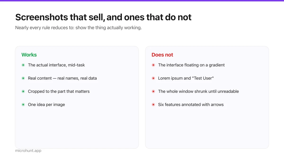
Product Screenshots and Demo Videos That Do the Selling
Your first screenshot is your social preview and often the only thing a visitor looks at. Here is how to make it earn that.
7 min read
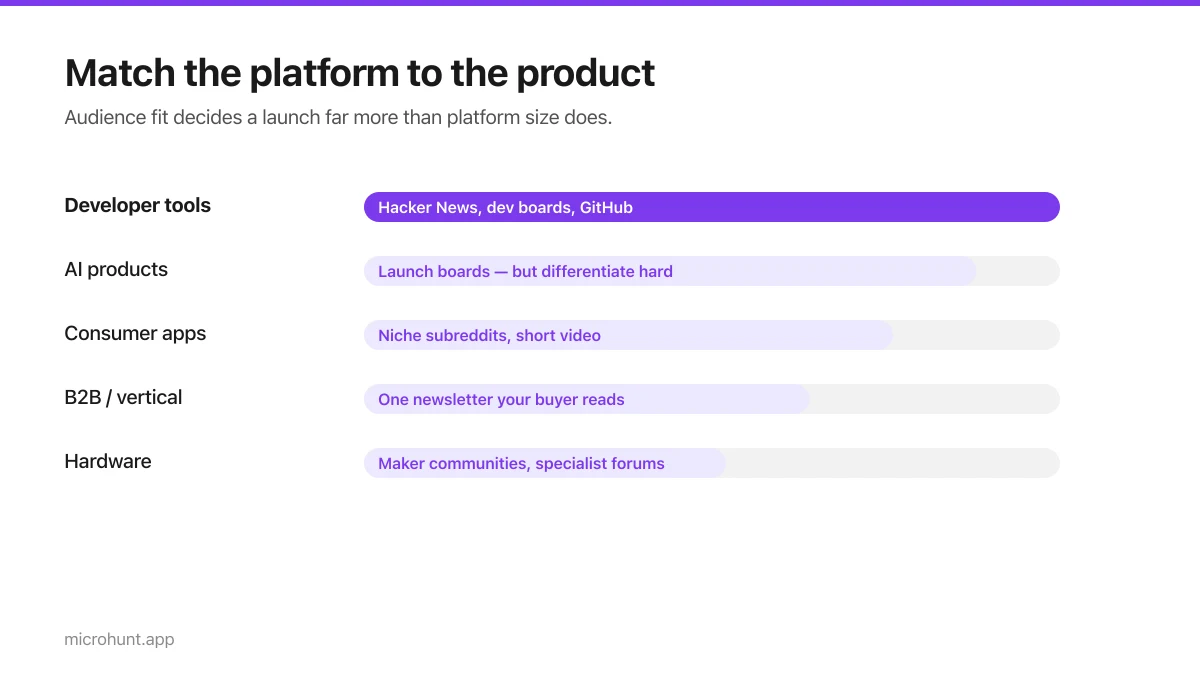
Best Product Hunt Alternatives for Launching in 2026
Where else to launch when Product Hunt is not the right fit — what each platform is actually good at, who shows up, and what it costs.
8 min read
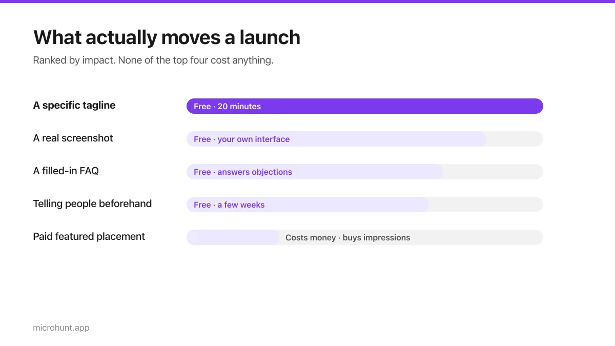
Free Launch Platforms for Indie Makers (No Budget Needed)
You do not need to pay to launch. Here are the places that are genuinely free, what each expects from you, and where paying is actually worth it.
7 min read
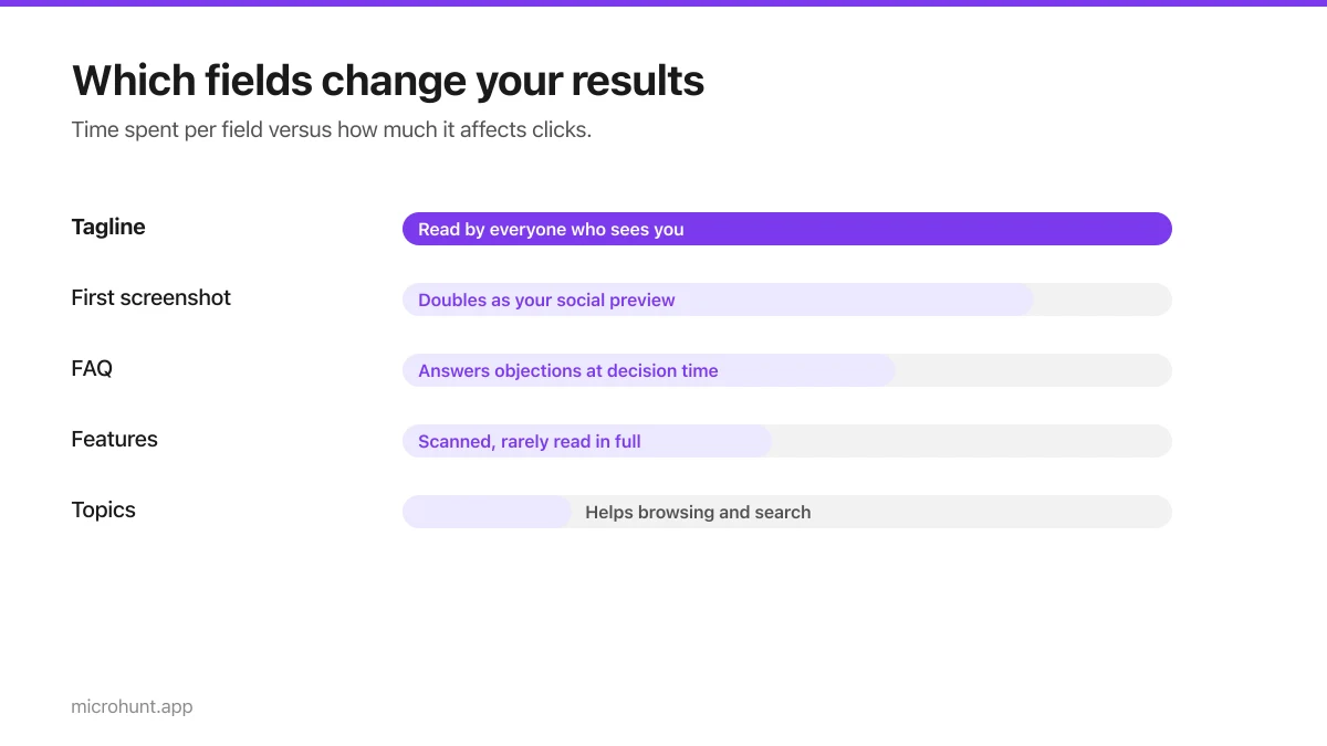
How to Submit a Product on Vuru (Step by Step)
A walk through the submission form, what each field does to your page, and the fields most people leave empty that they shouldn't.
7 min read
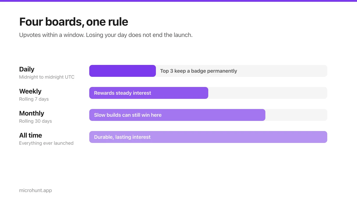
How Vuru Ranking Works (And How to Win a Badge)
Launch windows, upvotes, podium badges and what we do about vote manipulation — the whole ranking system explained plainly.
7 min read
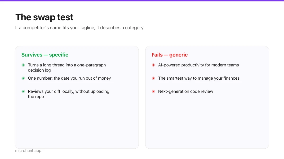
How to Write a Product Tagline That Actually Gets Clicked
The one line most people will ever read about your product, and a simple test for whether yours is doing any work.
7 min read
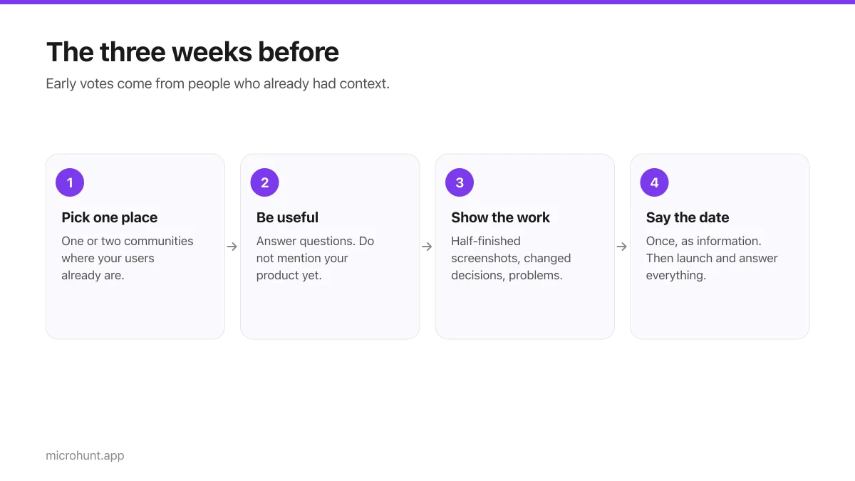
How to Get Your First Upvotes Without Begging
What actually generates early votes, why vote-for-vote groups do not work, and the approach that keeps paying off after launch day.
7 min read
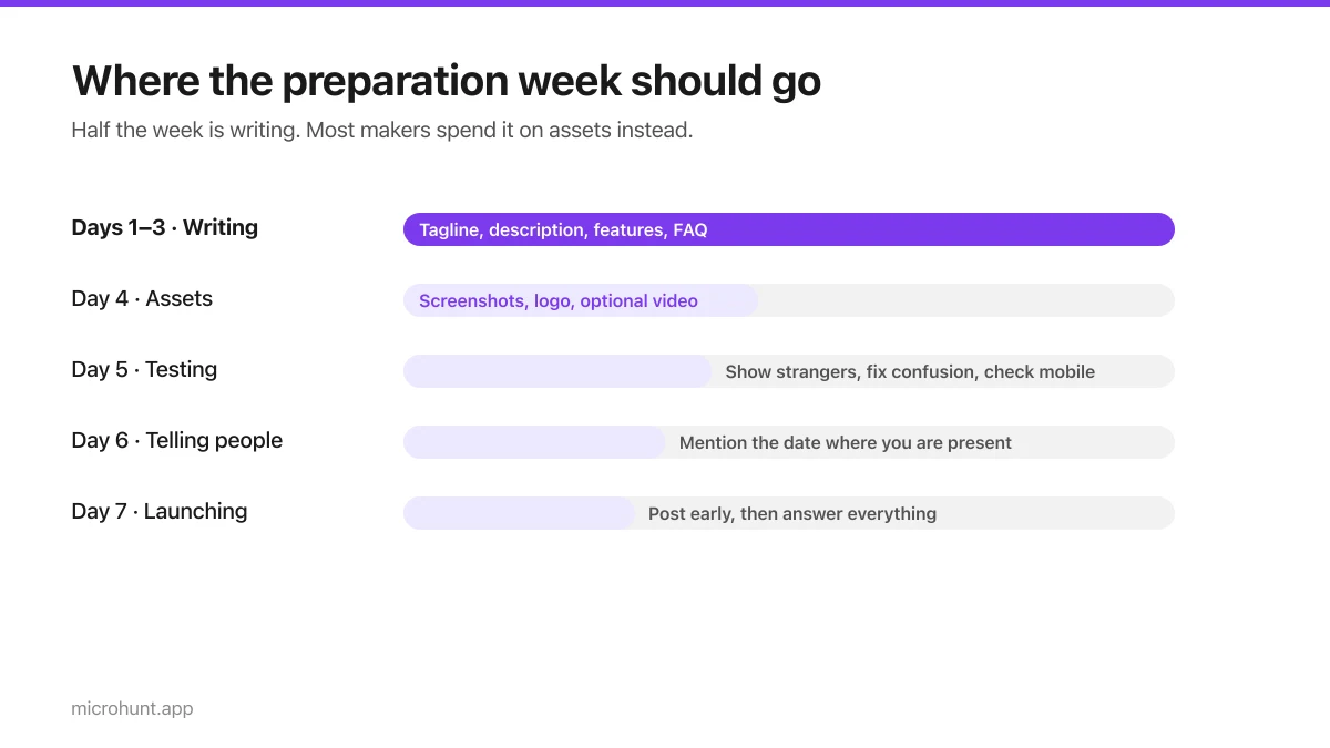
The Seven-Day Launch Checklist
A day-by-day plan for the week before you launch, weighted towards the things that actually change the outcome.
8 min read